Category Archives: Layout issues

Tips on how to lay out your book.

Writing a non-fiction project – Headings

I often get non-fiction projects to typeset for print, and I’m noticing a few typical problems, especially when those projects are not copy-edited. So here’s some tips to help you.

Plan your hierarchy of headings

Decide on your hierarchy of headings and plan your content accordingly. It can be easy to get carried away when writing, slapping in headings as you think they’re needed and putting some sort of formatting on them. But if you plan your work out by using the headings as a skeleton, it will be clear what should be a top level heading, what’s the next stage, what are just emphasised lines etc.

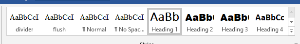
All headings should be hierarchical – no heading 3 under a heading 1 without a heading 2 between. This is now essential for proper ebook formatting, but good advice for print books as well. There may be content under the heading, or it might go straight to the next heading – that’s up to you.

  • Heading 1
    • Heading 2
      • Heading 3
  • Heading 1
    • Heading 2
    • Heading 2
    • Heading 2
      • Heading 3
    • Heading 2

This will also lead to a clear structure of information in your book, which will help your reader to find the information they need.

Use styles for your headings

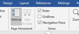
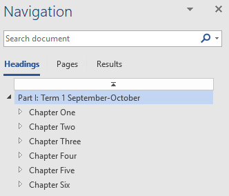
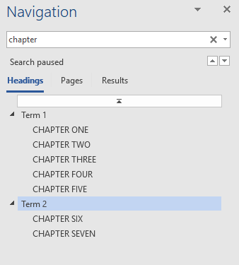
The Styles function in Word will show you the structure of your work in the Navigation Pane (View/Navigation Pane). This also helps with moving around the document.

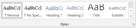
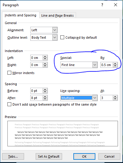
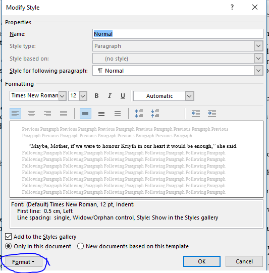
Styles come in two parts: defining the style you want to use for your heading, and defining what that style looks like.

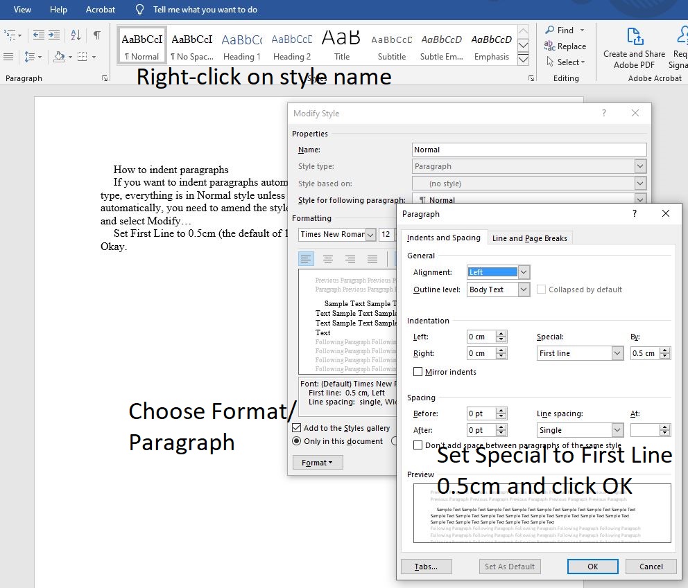
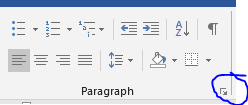
To apply a style to your heading, highlight the heading or put your cursor within the heading then select the heading level you want from the Style pane. Once you’ve done that throughout, then changing the settings for that style will apply the changes automatically to every heading that uses that style – much better than going through and changing all manually!

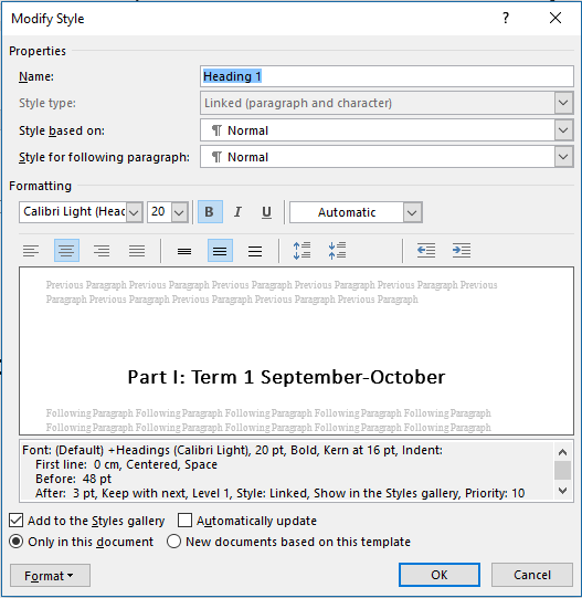
To change the appearance of a style, right-click on it in the Styles panel and choose Modify… Make whatever changes you want, and then confirm those changes.

Alternatively, format one heading to the appearance you want, then right-click on the style in the Styles panel and Update style to match selection. That will both apply the style and set the formatting as you want it.

Think about the look of the headings

When writing those headings, be careful that they’re consistent. It can be easy to switch between words – Three ways to make money – and numerals – The 5 best ways to travel, for example.

Consider cases – do you want ALL CAPITALS or Title Case or Sentence case for your headings? Remember that your typesetter can very easily force all headings into capitals if they’re typed in title or sentence case, but it’s more fiddly to change all capitals into a different case without finding and changing each occurrence. And fancier fonts are very hard to read in all capitals.

Front matter in a novel

The most important part of your book is the story, but when you’re producing a book for print there are other sections to consider as well. Please note that here I am considering novels only – non-fiction books are a completely different issue.

The front matter is everything that comes before the main story.

This must include:

  • title page
  • imprint page

It may also include any or all of these:

  • half title
  • dedication
  • about the author
  • praise/reviews
  • list of previous works
  • acknowledgements
  • author’s note

Fiction books do not usually include a table of contents.

Some of this content is necessary, while others are optional. And there are conventions as to whether the content appears on a recto (right-hand page) or verso (left-hand page).

The Title page consists of the title, any subtitle, author’s name (but without the word “by”) and maybe the publisher’s name/logo. The title page is always recto.

The imprint page contains information about the publisher, copyright declaration, any other legal declarations, information about the printer, any information about design etc. This is always verso, on the back of the title page.

The half title consists of the title of the book only, usually centred on the page. This dates from when printers would have stacks of books sitting around waiting for their covers, and they would need to be labelled so they could be identified easily! If a half title is included it is the very first page of the book, and therefore recto.

The Other Books section is most often included as a verso page, and this is often a good pair with the half title. This is a good opportunity to provide information such as the order of a series, or to direct your reader to other series you may have written.

The Dedication is usually recto, giving you the opportunity to dedicate your work prominently to someone special or who has played a part in the creation of the book.

The About the Author section may be at the very front of the book, as an alternative to the half-title. Alternatively, you may prefer to put it amongst the end matter.

Praise/reviews often appear before the title page if used. Again, this can provide an alternative to the half title for pairing with the Other Books page.

Author’s Note and Acknowledgements may both be included within front matter or back matter, but if they appear as front matter it is more common to start them on a recto.

All this means there may well be blank pages included in your front matter. This should be considered along with your printer’s requirements – if the printer prints in 16 page signatures, then your page count will made up to the next 16 count with blank pages if necessary. If the choice is between having extra front matter or extra blank pages at the back, I would choose the front matter. If the choice is between extra front matter or fewer pages and therefore lower cost, that might change the decision!

The main content of your book should always start on a recto. Some books follow the convention of starting every chapter on a recto, leaving the previous verso blank if needed, while others will start the chapter on whichever side of the page it falls naturally. Either way, the norm these days is to always start each chapter on a new page, with a large heading partway down and the text itself starting at about the 1/3 mark.

Why not pick up a few books from your bookshelf and take a look at the front matter? That will give you a feel for the standard layouts and content.

Indenting via Styles

To apply an automatic indent to your style, right-click on the style name and select Modify…

Choose Format/Paragraph from the bottom left corner of the dialog box.

In the next dialog box set Indentation Special to First Line and size to 0.5cm (the default of 1.27cm/half an inch is too big and will leave unsightly gaps).

Click on OK.

All styles based on Normal will update to include this, so you might need to modify headings etc to remove the first line indent so they line up properly.

Submitting your manuscript

I do a lot of work with formatting and proofreading manuscripts for print or ebook, and find the same problems cropping up again and again, so here’s some suggestions to make life easier for yourself and for your formatter:

  1. Don’t get too fancy with your formatting.
    Times New Roman 12pt is straightforward. Paragraphs should be indicated with either automatic indenting or automatic spacing between – this should be done via the Styles function, preferably, as any change that overrides the styles function could cause issues throughout the file. Using tabs or spaces to indent, or leaving blank lines between paragraphs, is not a good idea. If you don’t know how to indent/space automatically, your best option is to leave the text un-indented and let your formatter deal with it.
  2. Be careful with versions.
    Make sure your file versions are clearly labelled, and make sure you are sending the right version to your formatter/proofreader. And don’t keep sending updates once you’ve sent them a file! If they have to start all over again with a new version you’re increasing the time taken and almost certainly increasing the cost involved.
  3. Give any changes and respond to any queries as clearly as you can.
    Gather all corrections together and provide them in a single clear list, with indication as to what is wrong and how it needs to be put right. Text to search on is always useful.

Creating a table of contents

A table of contents is a quick way to navigate around your document. In an ebook, it can provide links to chapter headings. In a print book, it will list page numbers for quick reference.

Styles are the key to your table of contents – if you consistently style chapter headings with the style Heading 1, then any ebook generator should take those styles and create your linked table of contents automatically.

The bonus is that you can use these styles to help you navigate around your Word document as well, using the Navigation Pane.

As always, there are two elements to working with Styles – apply your style to the text, and modify your style to have the appearance you want.

To apply the style, highlight the chapter heading and on the Home tab, click on the style labelled Heading 1.

To modify the appearance of that style, right-click on the style in the listing and choose Modify…

Use the Format button on the bottom left to access the main formatting dialog boxes.

Changing the appearance of any style in this way will automatically change the appearance of any text that has been marked as that style.

Alternatively, if you’ve already got your heading just as you want it to appear, highlight it, and then right-click on the style in the Styles panel. Choose Update Style Heading 1 to match Selection.

This will both mark the text with that style and set that style to the same appearance as the highlighted text (updating anything else marked with that style to the same appearance).

View the Navigation Pane by ticking the box on the View tab.

This provides a quick way to see and move around the structure of your document. If you’ve used more than one level of Heading (Heading 1, Heading 2, Heading 3 etc), then you can see the hierarchy of your layout.

To include a Table of Contents in your printed document, place your cursor where you want it to appear and then on the References tab click on Table of Contents. You can use an automatically generated Table of Contents, or customise it to create your own (for example, you can choose how many levels of heading you want to show – do you want just chapter headings, or do you want subheadings listed as well?).

What are styles?

Styles provide an efficient way to manage the appearance of any document. For anything other than a very simple title/content document, there’s usually a structure: headings, subheadings, body text. If you apply styles throughout your document, it’s a much simpler process to change the appearance of any one of those elements without affecting the rest.

Styles have two stages:

The first task is to decide what role a piece of text plays in your document. Is it a top-level heading? Subheading? Body text? Quote? Caption? Apply a style to match that role. There are several built in to Word that you can use or modify, or you can create your own.

The second task is to decide how that type of text should look. To do this, you modify your style, either by right-clicking on the style in the style list and selecting Modify, or by modifying your text and then right-clicking on the style in the style list and choosing Update Style to Match Selection.

In Word, you can create paragraph styles, which affect the whole paragraph, character styles, which affect only the characters the style is applied to, or a combination of both.

For example, Emphasis is a character style that applies italics to the selected text. Using Emphasis style rather than the Italics button means that if you later decide to change the font in the whole document you don’t risk losing your italics.

Setting a document up with all formatting done through styles rather than direct formatting is just a tiny bit more work than formatting directly, but with any substantial document it’s then so much easier to amend if needed.

Another advantage is that you can use the styles to check your structure and to move around your document easily, by using the Navigation Pane.

The styles may also be used to generate an automatic Table of Contents.

Indenting paragraphs

If you look inside any printed book, you’ll see paragraphs are indented. But how and why is this done?

The why is easy. There are two ways to visually signal the start of a new paragraph. One is to leave white space between paragraphs – a blank line or half a line is the norm. But this spreads the text out more on the page. A more compact way is to indent the beginning of the paragraph a little, which gives the same signal but takes up less space.

As to the how, there are a few ways to achieve it, some good and some not so good.

The worst way is to use spaces, because spaces can vary in width visually, and because you would need to be very careful to always add the same number of spaces to give a consistent look.

Then there’s tabs. Another way that works, but isn’t very efficient. What if you change your mind? You would need to remove – or add – tabs throughout.

A better way is to use the paragraph formatting. In Word, click the little marker at the corner of the paragraph formatting section on the Home tab.

This opens the paragraph formatting box.

Why set to 0.5cm? Anything bigger risks gaps in the text.

See how one line finishes short and looks like it’s floating out of place? Smaller indents are your key.

The best way to apply indents is to use the paragraph setting in the Styles. Apply your style to the text, and then right-click the style name and choose Modify.

Use the Format button at the bottom, select Paragraph… and then make the adjustment as above. This will then be applied to all text set to use that style.

Should you later want to adjust your indents, then all you need to do is modify the style again.

So much easier than trying to delete extra spaces or tabs!

The benefit of styles

When typesetting for print or ebook, styles are important. But what are they, and how do they help?


Just imagine the structure of your book for a minute. It’s probably something like

  • chapter number
  • chapter title
  • first para flush left with a drop cap
  • main text indented
  • divider
  • para flush left
  • main text indented

And repeat for every chapter, as often as necessary.


Now imagine that you want to increase the size of the chapter title, or change the font of the main text. Without styles, you would need to go to each small chunk in turn and change the formatting on it. If you have two or three changes to make on each chunk, it could take some time. Even using format painter, it’s fiddly and there’s the danger of missing something.


Now consider using styles. Styles come in two stages – tell the text what style you want it to use, and tell the style how it needs to display the text. So you’ll set the Heading 1 style to the right font, point size and weight, and you’ll highlight the text and apply the Heading 1 style. You can do these two steps in either order.


Once you’ve been through the entire document, applying styles to everything, it’s just a matter of changing the settings for that particular style, and that will then be applied all the way through the document, wherever that style has been applied.


One additional benefit of using styles correctly is that an automatic Table of Contents can be generated, using the specified styles to pick out the links that are needed and automatically adding the correct page number. This can be updated as the layout of the book is altered.


It’s also possible to save a set of styles, so it’s easy to copy them over from one document to another, ensuring efficiency and consistency.


When do I need a bleed?

One issue I’m sometimes asked to sort out is a bleed. So what is a bleed and when is it needed?


bleed illustration 2As part of the printing process, pages are trimmed. This is not normally an issue on print books, because any text would be well away from the edge,  but if you have illustrations or photos in the book that need to go right to the edge, then it’s important to create the image slightly larger than needed. This way, when the page is trimmed, the image will bleed off it. This avoids an unsightly white line showing, should the trimming be a fraction off (which is very possible).


This is usually done in publishing software, which has a bleed feature built in to it. The software will add trim marks to the file, so that the printer can trim to the right size.


A bleed is always needed in a cover design.


Formatting for ebook

The process of formatting for ebook starts in the same way as formatting for print; in fact, ideally I’d be working from the same Word file, and preparing it for both types of formatting by first ensuring all the formatting is done through styles, and not just ad-hoc. Once the Word file has styles applied throughout, importing it into Jutoh, the program I use for ebook formatting, is straightforward.


Within Jutoh, I’m prompted to fill out a form containing the metadata for the book, including author and publisher details, genre and information, and then choose which files to import for the main text and the cover. With styles applied, I can set the document to split at the chapter heading style, and then complete the import.


Now I need to go through the document, checking the formatting has imported properly, making sure the splits are at the right places – while the chapters should split automatically, the front matter and back matter often need attention – and ensuring that any blank lines at the end of chapters have been removed. While these can easily go unnoticed within a print book, there’s a risk that a single blank line at the end of a chapter, falling at the wrong place, will appear as a complete blank page in an ebook.


The options for variation of text in an ebook are very limited. While in a print version almost anything can be achieved (and one of my projects is exploring the possibilities in a fun way!), in an ebook there is only really relative font size as an option, as the reader can (and should be able to) override font and font size choices for their own reading comfort. Another trick that I’ve used to make text stand out is to block-indent rather than just indent the first line of the paragraph, but ebook readers vary in how they handle indents, so varying indent size or adding a right indent isn’t a viable option.


With most fiction ebooks, the table of contents can be handled automatically, while for others or for non-fiction, I often have to handle the table of contents separately, ensuring that links are provided for the parts that need links, that they are displayed consistently and that all links point to the right place.


Images need checking to ensure they are the right size. While Jutoh offers a facility for resizing images, this can be inconsistently handled across readers, and it is far better to ensure the images are correct before importing.


Once I’m happy with everything, it’s time to hit the export button. I can choose the export type (epub or mobi, usually) with the click of a button, and the file is created.


That’s not the end, of course! There’s still viewing on different screens, checking the front matter and back matter are displayed correctly, making sure the table of contents works if I’ve had to handle it separately, and skimming through to see whether any special formatting is handled right. I have a few different devices available, from ipad and iphone to kindle touch and kindle keyboard, and so I’m able to check how they each deal with any issues.